— ONE Championship App: A User-Centered Redesign
Project Overview:
The ONE Championship mobile app serves as a comprehensive platform for combat sports fans, offering live streams, news, results, and athlete information. As a regular user, I identified key usability and visual design issues that hindered the overall experience. This project focuses on redesigning the app's home and results pages to improve content discovery and visual engagement, leveraging ONE Championship's brand colors (white, black, gold) to create a more intuitive and delightful user experience.
The Goal: Optimize the app's usability and visual appeal, delivering a delightful and intuitive experience that enhances content discovery and reinforces the user's connection with the ONE Championship brand.
1. Research and Discovery Process
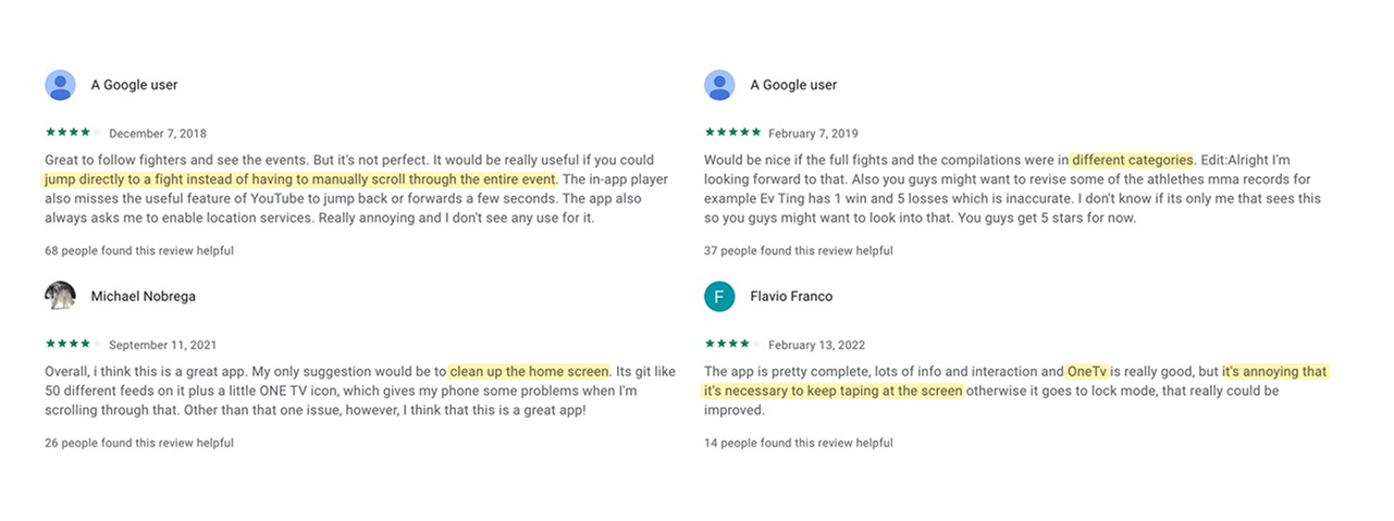
To guide the redesign process, primary research focused on identifying key user pain points through analysis of Google Play Store reviews. Reviews were prioritized based on 'helpful' ratings, revealing critical issues such as the lack of time-stamped fight access, home screen clutter, uncategorized events, and the obstructive OneTV mini player. These findings directly informed the redesign's focus.
2. Defining the Problem
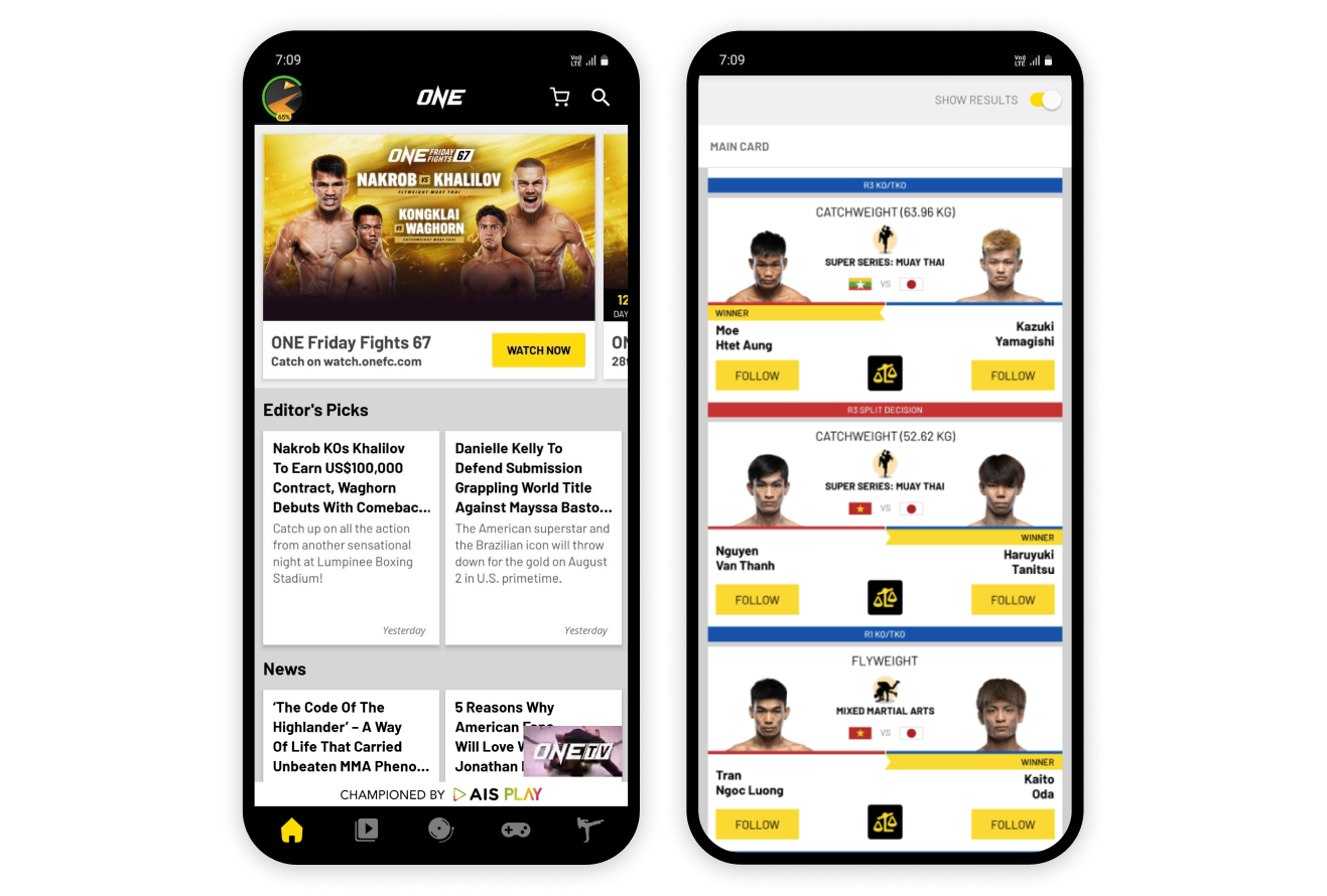
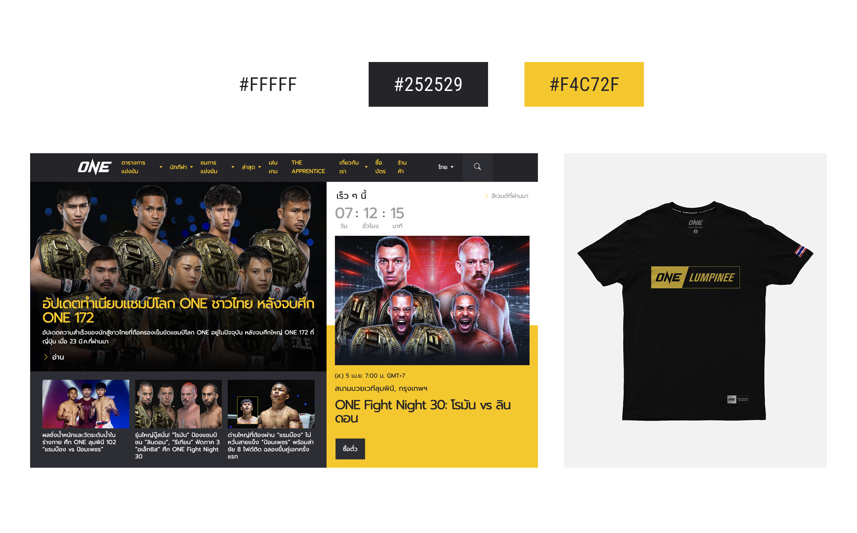
The app's predominantly white, black, and grey design, while intended for a minimalist aesthetic, compromises information skimmability. Specifically, the home screen suffers from truncated article headlines and a non-closable OneTV mini player.
The results screen presents similar usability issues. The red/blue bar system, meant to indicate winners, requires users to decode the information due to unclear association with top or bottom bouts. This lack of clear hierarchy leads to visual fatigue and difficulty in quickly identifying winners.
The Problem: The ONE Championship app suffers from a lack of clear content organization, resulting in a cluttered home screen, ambiguous navigation, and difficulty in quickly accessing specific fight moments or relevant news. This leads to user frustration and reduced engagement.
3. Ideation
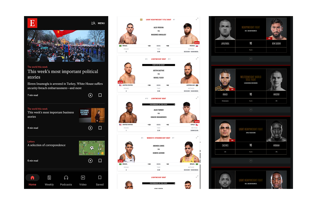
To reimagine the One Super App's news-heavy home page, I researched news application layouts. The
Economist's design, particularly its use of brand red as an accent, influenced my approach. For the results
page, I researched competing combat sports organization layouts to identify innovative solutions and
determine potential improvements.
4. Design Implementations and Comparison
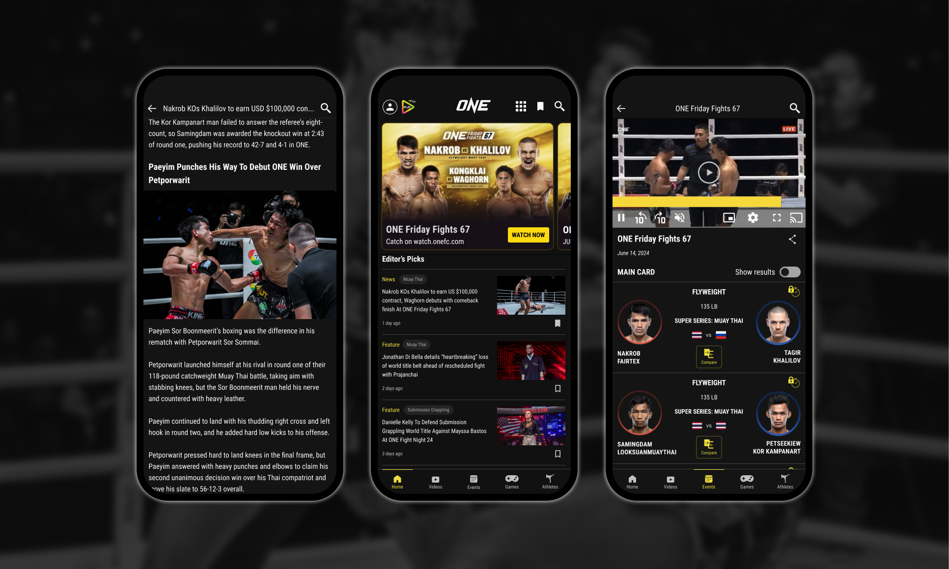
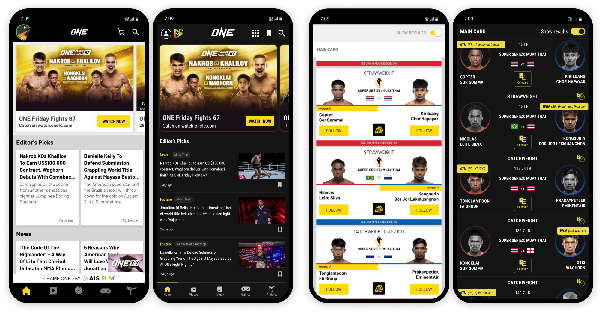
Home screen:
- A save button was implemented to the articles, allowing users to bookmark fights and articles for future reference.
- Recognizing that fans often focus on specific sports within the organization, article tags (Muay Thai, Submission Grappling, MMA, Kickboxing) were added, providing instant context and enabling users to quickly identify relevant content.
- The navigation bar was improved by adding labels to icons, eliminating ambiguity.
- The OneTV mini player was moved to a submenu in the header, addressing its obstructive placement on the home screen.
- The large AIS Play banner, above the navigation bar, which occupied valuable screen real estate, was replaced with a smaller logo in the header to reduce visual clutter
Results screen:
- A brand-accent colored bar now spans the fight details, displaying the round and method of victory above the fighters' headshots.
- Circular frames with gradient strokes (red or blue) replaced straight edges for the headshots, adding visual interest.
- The loser's photo is desaturated for quick identification.
- Numeric weight class is included for context.
- For video content, time skip buttons were introduced, offering a premium feature that allows users to jump directly to fight segments.
5. Conclusion & Critiques
This redesign project aimed to address critical usability and visual design issues within the One Super App, focusing on improving content discovery, clarity, and overall user engagement. By analyzing user feedback from app store reviews and drawing inspiration from established design principles, I implemented changes to the home screen, results page, and navigation, along with introducing new features like article save functionality and sport-specific tags.
In a professional context, incorporating usability testing throughout the design process would be essential to validate design choices and refine the user experience. However, as a personal project, this redesign was completed without formal usability testing. While this limitation is acknowledged, the design choices were based on identified user pain points and best practices in UI/UX design.